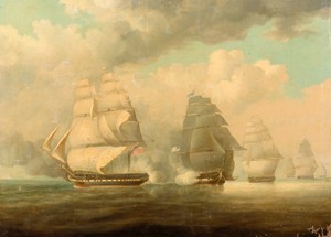
Macedonian 1.0
by wjw on July 31, 2012
 Here’s my first pass at a cover for the next sea adventure.
Some of you quite intelligently suggested a period font for Brig of War, and I tried it both with BoW and this. Alas, there is a reason that people felt it necessary to invent new fonts. The old ones just didn’t carry the message very well.
(Plus, all the esses looked like effs.)
((That’s a joke, by the way.))
The original art is from the period, by a painter named Higgins. Here’s the original, just so you can see how far I took it.

 Here’s my first pass at a cover for the next sea adventure.
Good pic. I like how you darkened it and added the direct-hit cannonball effect.
I would brighten the title a bit; it seems too muted. I also suggest lessening the amount of offset for the shadow on the series ID. Because the font size is smaller than that used for your name, the shadow needs to be closer to the text to appear balanced.
I like the cover, I don’t like the mixture of sans serif and serif fonts across it, the sans font looks out of place, and I *really* don’t like the way that “Williams” is stretched horizontally, distorting the aspect of the letters.
Really like the art, though.
I’d have stayed more consistent with the Brig of War cover. Perhaps a different background colour for each book in the series, but the same size and position of the painting and the same fonts and location for your name and the Privateers and Gentlemen tag. Also not a fan of the title font.
I am looking forward to reading these, I’ve been vaguely aware of your naval books for years ( I do have a copy of the Heart of Oak rules) but have never seen one.
Works for me.
It’s a start, although I agree about the overall look lacking impact. And since it’s the second in the series, I think personally you should copy the same style as the first book across all three. That would make it much more obvious that they’re linked.
I have to agree that period titles are hard to read, and are probably particularly ill-suited to ebooks. Looking at the last cover and this one, I’ll say it’s specifically the use of a sans-serif display font for the title more than the date of the font — the author’s name and subtitle don’t fight with the artwork at all, and I think it’s just serif versus sans-serif. You might try using the same font for everything on the cover, possibly using regular fir your name and the subtitle and bold for the main title. Or see how it looks if you set your name and the subtitle in a sans-serif font and the title in a serif font.
Or you could do what I’d do, and vanish for five years to study calligraphy so you can hand-letter your titles.
Times New Roman for the Title as well?
Do I detect a quote from Stan Freberg herein? “It’s in. It’s very in.”
Comments on this entry are closed.