Aristoi. Finally.
by wjw on April 3, 2012
It should be available for the Nook in the next few days, and via iBooks, Kobo, etc., whenever they get around to it. (My job here is done.)
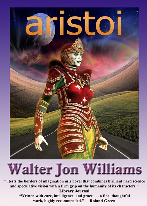
And here’s the final version of the cover. I found a variant piece of artwork for the background that features a darker sky, so that the Princess’s head doesn’t get confused with the background when she’s shrunk to postage-stamp size.
It’s baroque, I think, but not too busy.
It’s not perfect, then then cover art rarely is. We’ll see if it gets the job done.
 I’m pleased to report that Aristoi is now available for the Kindle, and in multiple formats via Smashwords.
Awesome! I remember loving that book but I only have it as a French translation so I’ll get the ebook and finally read the original version. 🙂
Nice work on the cover. Captures the exotic feel without having to capture any specifics of the book.
How was the formatting issue solved?
It is not my place to say, however, he started off with duck tape and dental floss. When that did not work, he defaulted to “The [deleted] with this! Who needs all that fancy formatting anyway?”
The problem is, there are two kinds of Kindle. There is the soft Kindle that runs on desktop computers, iPads, Androids and the new Kindle Fire. All other Kindles (including the new ones, other than the Fire) run on the old software.
The old software does not see tables. The new software can, however, it requires quite a bit of manual editing of source code. Unfortunately, Amazon does not let you create one version of the book for the old devices and one for the new.
The other problem is, even with the new software, the tables did not scale well. You could fake something together with lots of hard page breaks, however, it was never perfect.
Not bad at all. Here’s a thought. Put a drop-shadow on the title so the ‘r’ doesn’t vanish against the planet.
Codexus: I hope that the French edition will also be available in e-formats, with the help of my original translator Jean-Daniel Breque.
I definitely like the background on this cover. Good match.
I look forward to reading it in the ebook format and comparing how the text single column text feels compared with double column. I am an instructional designer so I do get wrapped up in how layout affects content. It’s an opportunity to study the effect. Thanks Walter!
Personally, I prefer the cover of Polish translation: http://www.taniaksiazka.pl/aristoi-williams-walter-jon-p-62920.html
Comments on this entry are closed.