Aristoi 1.0
by wjw on March 29, 2012
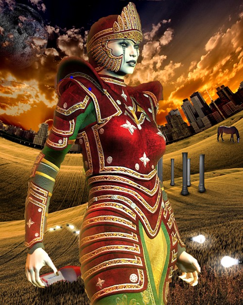
 Here’s my first stab at cover art for Aristoi.
I’m combining two pieces of stock art. The woman in the foreground was detached from her original background (which was too busy and distracting), and placed against a surreal backdrop by a completely different artist.
One of her arms conveniently obscures a Magritte-like figure in a bowler hat.
I don’t know what the light bulbs are doing there, though the extra-large ladies’ shoe probably indicates a recent visit by a transvestite.
It could use some cleaning up. And maybe I can find a different backdrop— I just used this one because I’d already bought the rights to it for another project.
Though the picture doesn’t illustrate any particular scene in the novel, I think it gives both an idea of the baroque complexity of the world of the Aristoi, as well as its artificiality.
Let me know what you think.
 Here’s my first stab at cover art for Aristoi.
Nice bit of photoshoppage. It /will/ be interesting to see what colors you find to contrast with that so it’s readable in postage stamp size. 🙂
-JRS
The lady is a sleeping android as the light bulbs make me think of electric sheep.
I like the contrast and color choices. The sky is quite cool. Your image size is at 149 KB. I think Amazon asks for 127 KB or less. If anything, the image strikes me as just a bit over complicated. Can you choose a simpler background? If not, I think the image will work quite well.
You know what bad people like me say, If it’s baroque and it works, don’t fix it.
Pretty cool.
Well, other than the book’s protagonist and POV character being male…
This isn’t necessarily a criticism, and I’m waiting for the ebook to read Aristoi, so I don’t know at all whether it’s a good fit. But the first thing that comes to mind is an over-the-top drum majorette’s outfit from a well-funded midwestern high school whose football team is called The Aztecs.
I like it. Matches up pretty well with my memories of the book, and even looks a bit like the cover art on the softcover copy I have. The ladies shoe and the lightbulbs are kind of distracting. If you’ve got the Photoshop chops you should try to cover them up; if not, you could crop the image and extend the sky (which you may need to do anyways to get space for the title).
It would be super-keen if you could find a picture for the background that resembles the dacha in a snowy landscape, given the pivotal role that image plays in the novel.
I like it.
Took a while to figure out what bothers me about this, and I think it’s that the central figure is too large relative to the overall size of the piece. The overall effect really is bizarre, but it’s even more disconcerting when the woman looks like some sort of giant android elf-queen. If she was scaled down about 15-20% or so, I think it would help.
Even then I think the piece is too bizarre for my tastes. And while it’s been a while since I’ve read Aristoi, this doesn’t really bring any of the story to mind for me.
Sorry I don’t have more constructive feedback. 🙁
She looks like I would imagine Zhenling to look, but dresses more like I would expect Gabriel to dress.
The lightbulbs are definitely confusing and I can’t envision how to imply the many-layered universe in which Gabriel and crew live. Erich’s idea of the dacha would be good. The great central square where the new Aristoi ceremony is held (can’t remember the name) might also be another backdrop that could imply complexity.
But for
Oops! Erase that “But for” please. I don’t know where I was planning to take that.
Thumbs down. Looks like a 13-year old girl’s avatar from one of the more fashion-conscious MMOs.
Another thumbs down. It’s too busy, at the very least.
Thanks for the comments, everybody.
I tried to find a picture of a male who dresses like Gabriel, but it wasn’t on. I tried to find a picture of a dacha, which I did, but if you put a dacha in the background it becomes a story about Russia in the past, instead of a science fiction story about the future.
I think we’re stuck with Princess here, since she was the only character I could find who was anything like baroque enough for the setting. And I like the idea of the background more than I like the background itself . . . and I know the artist tends to do a lot of variations on a single theme, so I think it’s time to go looking . . .
Comments on this entry are closed.